Showing posts with label wp. Show all posts

Friday, May 15, 2015

Application Bar In Windows Phone

Application Bar

  • Application Bar is a pop up panel at the bottom of the application page.
  • Application Bar contains four buttons, which allows to perform some action.
  • Application Bar can not be hidden by the keyboard or other elements. when we open application bar, it will be covered entire page with transparency is set 1, then the application bar covers the screen, using transparency effect.
  • Application Bar to provide users with quick access to an application’s most common task.

Application Bar UI:


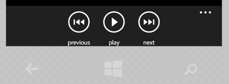
  • By default application bar is a row of icon buttons and ellipsis along the bottom of the application.
  • The application bar has built in animation that is displayed as the menu is shown or hidden.
  • Application Bar automatically adjusts when the phone changes orientation.
  • if application bar in minimize, it’s looks like


  • if we click on ellipsis on application bar


Menu Items:

  • We can add one or more text based menu items.
  • The menu items are used for application actions that are less frequently used.
  • The text of the menu items is automatically converted to all lower-case characters.
  • If we add menu items in application bar.


Application Bar Syntax:


<phone:PhoneApplicationPage.ApplicationBar>
   <shell:ApplicationBar>         
    <shell:ApplicationBarIconButton Text="Play" IconUri="[Path]" />   
</shell:ApplicationBar>
</phone:PhoneApplicationPage.ApplicationBar>


Menu Item syntax:


<phone:PhoneApplicationPage.ApplicationBar>

        <shell:ApplicationBar>           
            <shell:ApplicationBar.MenuItems>
                <shell:ApplicationBarMenuItem Text="About"/>
                <shell:ApplicationBarMenuItem Text="Help"/>                
            </shell:ApplicationBar.MenuItems>            
        </shell:ApplicationBar>
</phone:PhoneApplicationPage.ApplicationBar>


Application bar properties:


  • Mode : Specifies the size of the Application Bar when it first appears on a page, default or minimize.
  • Opacity : opacity values are between 0.0 and 1.0. The opacity of the application bar can be adjusted, but we recommend that you use only values 0.0, 0.5 and 1.0.
    • 0.0 means the Application Bar is completely transparent, the Application Bar laid over the page, so application page is not resized.
    • 0.5 means the Application Bar is partially transparent, the Application Bar laid over the page,  so application page is not resized.
    • 1.0 means the Application Bar is completely not transparent, Application Bar covers the current page, the Application page is resized to the area of the screen not occupied by Application Bar.
  • BackgroundColor : We can set the background color to Application Bar.
  • ForegroundColor : The foreground color of Application Bar, this color affected to icon buttons, labels, and the menu item text.
  • IsMenuEnabled : it’s a boolean values , it’s indicates whether user can see the menu items when they expand the Application Bar.
  • IsVisible : Indicates whether the Application Bar is visible.


Guidelines


  • Use the Application Bar instead of creating your own menu system.
  • Use default system theme colors for the application bar, if we use custom colors for application bar can affect the display quality of the button icons.
  • Avoid using long text for menu items because that text will run off screen. The recommended maximum length is between 14 to 20 characters.
  • Avoid using more than five menu items on an Application Bar, because it will force to user to scroll.

Global Application Bar

  • Global Application Bar can be reused on multiple pages in our application.
  • In App.xaml page, we need to create application bar as a static resource.


Syntax:
<Application.Resource>
//Application Bar
</Application.Resource>
Demo:
Create an application for Application Bar Demo


  • Create a new project by selecting File menu > New Project or short-cut keys Ctrl+Shift+N.
  • Choose Windows Phone Template, and change project name as "AppBarDemo"


  • MainPage.xaml:
    • We can create page level Application Bar , Add bellow code in PhoneApplicationPage

    <phone:PhoneApplicationPage.ApplicationBar>

            <shell:ApplicationBar>
                <shell:ApplicationBarIconButton Text="Previous" IconUri="/Assets/transport.rew.png" />
                <shell:ApplicationBarIconButton Text="Play" IconUri="/Assets/transport.play.png" />
                <shell:ApplicationBarIconButton Text="Next" IconUri="/Assets/transport.ff.png" />
                <shell:ApplicationBar.MenuItems>
                    <shell:ApplicationBarMenuItem Text="About"/>
                    <shell:ApplicationBarMenuItem Text="Help"/>                
                </shell:ApplicationBar.MenuItems>            
            </shell:ApplicationBar>
    </phone:PhoneApplicationPage.ApplicationBar>

    App.xaml:
    • We can create App Bar for application level (global application bar),  we need add Application as a resource in App.xaml. Add bellow code in App.xaml page

     <Application.Resources>
             <shell:ApplicationBar x:Key="globalAppBar" IsMenuEnabled="True">
                <shell:ApplicationBarIconButton Text="Previous" IconUri="/Assets/transport.rew.png" />
                <shell:ApplicationBarIconButton Text="Play" IconUri="/Assets/transport.play.png" />
                <shell:ApplicationBarIconButton Text="Next" IconUri="/Assets/transport.ff.png" />
                <shell:ApplicationBar.MenuItems>
                    <shell:ApplicationBarMenuItem Text="About"/>
                    <shell:ApplicationBarMenuItem Text="Help"/>
                </shell:ApplicationBar.MenuItems>
            </shell:ApplicationBar>        
     </Application.Resources>


    ReuseAppBar.xaml:


    • Add page to existing application, that you can reuse App Bar ( i.e.
      ReuseAppBar.xaml )
    • Add bellow code in PhoneApplicationPage

    •                     ApplicationBar="{StaticResource globalAppBar}"

      Get source code for AppBarDemo

      Thursday, December 25, 2014

      How to create application in windows phone ?

      This article helps you to create basic application in windows phone 7/8.

      Before creating application we need (pre requirements) development tools like Windows Phone SDK 7/8. I have already shared pre-requirements in previous article

      Create First Application:

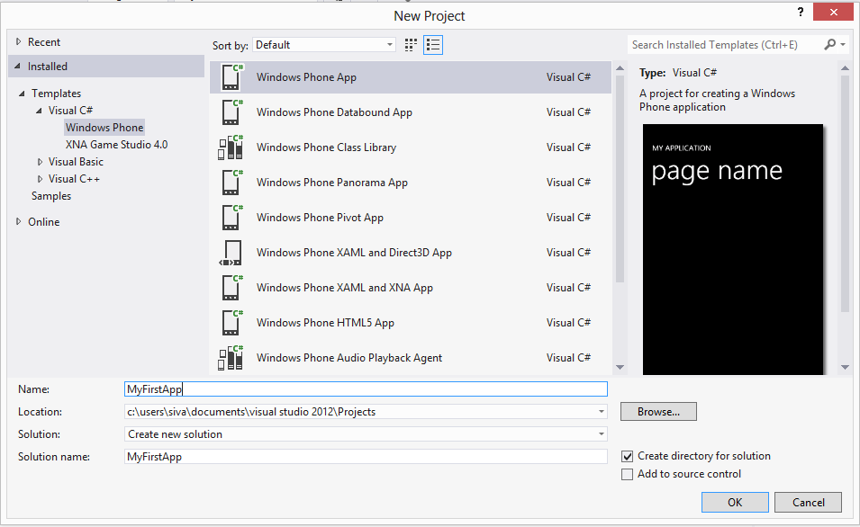
      Create first windows phone project using following steps.
      1. Launch Visual Studio Express 2010/2012.
      2. Create a new project by selecting File menu > New Project or short-cut keys Ctrl+Shift+N.
      3. Expand template Visual C# or Visual Basic  from the list of Templates on the New Project window left and select Windows Phone template.
      4. Once you select Windows Phone template, it will shows list of available built in project templates on right side of New Project window.You can choose your template depends on your requirement. I am choosing Windows Phone App template for first application.
      5. Final step for creating project is specify Project Name and Location at the bottom of New Project window. I have created project with name "MyFirstApp" and location is optional by default project directory created in installed location or you can change project directory location.
        Create First Windows Phone App
        MyFirstApp
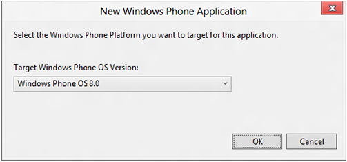
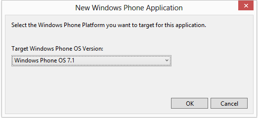
      6. Click OK on New Project window, it will open New Windows Phone Application dialog box. You can specify target windows phone version in New Windows Phone Application dialog box.
        1. If you select Windows Phone OS 8, your app will run both windows phone 8 /8.1 device/emulator but does not run on windows phone 7. Because higher version application will not work on lower version.You select Windows Phone OS 8
        2.  If you select Windows Phone OS 7.1, your app will run on windows phone 7 and above all versions, Because lower version will run on higher version.You select Windows Phone OS 7.1
      7. Once you click OK on New Windows Phone Application window it will added few build-in files and creates blank project for you. I have already shared default files in previous article .
        1. You can find project solution on View | Solution Explorer or open Solution Explorer using shortcut Alt+Ctrl+L.
      8. Open MainPage.xaml page from Solution Explorer.
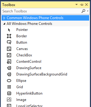
        1. Toolbox Window
          Toolbox Window
        2. Create UI using controls from View | Toolbox or open Toolbox using shortcut Crtl+Alt+X.                                                                                                                                           
                                                                        

      Demo:
      In this demo am going to explaining basic welcome message in Windows Phone.
      • Design UI in MainPage.xaml, Mostly we will focus on "ContentPanel". ContentPanel behaves like a page BODY. 
      • Change page name and application name in MainPage.xaml. 
                       <StackPanel x:Name="TitlePanel" Grid.Row="0" Margin="12,17,0,28">
                             <TextBlock Text="MyFirstApp" Style="{StaticResource PhoneTextNormalStyle}"                                  Margin="12,0"/>
                             <TextBlock Text="Home" Margin="9,-7,0,0" Style="{StaticResource                                                        PhoneTextTitle1Style}"/>                       
                      </StackPanel>
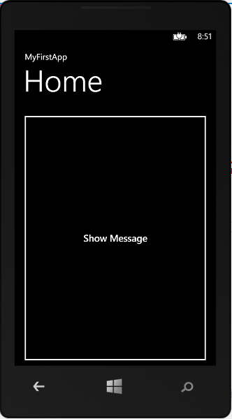
      • Add Button control to ContentPanel  in MainPage.xaml for displaying welcome message. You can add Button control from Toolbox using drag and drop or by write code. Button control occupies Content Panel entire space.
                        <Grid x:Name="ContentPanel" Grid.Row="1" Margin="12,0,12,0">
                             <Button Content="Show Message"/>
                        </Grid>


      MyFirstApp
      MyFirstApp
      •  OR you can add Button control in code-behind MainPage() constructor (MainPage.xaml.cs).  
        • First create a new instance of Button, then set the Button text as "Show Message" using Content property and add Button to ContentPanel as a children. This Button control added to page at runtime.
                           public MainPage()
                             {
                                       InitializeComponent();
                                       Button btn = new Button();
                                       btn.Content = "Show Message";
                                       this.ContentPanel.Children.Add(btn);
                             }
      • Our goal is display message while clicking on Button. For displaying message we are using MessageBox Class
       What is MessageBox ?

               Displays a message to user using Show overloaded method,  
        • Show(messaebody) method displays message box that contains message text.
                             Syntax: 
                                       MessageBox.Show(string messageText);
        • Show(messagebody,messageTitle,messageboxButtons) method displays message box that contains message text , message title and response buttons.
                             Syntax: 
                                      MessageBox.Show(string messageText,string messageTitle,MessageBoxButton                                   button);                                
         
      • Create Button Click event handler either XAML page or code behind 
               In XAML:
                            <Button Content="Show Message" Click="btn_Click"/>

               In Code-behind:
                              public MainPage()
                             {
                                       InitializeComponent();
                                       Button btn = new Button();
                                       btn.Content = "Show Message";
                                       btn.Click+=btn_Click; 
                                       this.ContentPanel.Children.Add(btn);
                             }

               Event Handler:

                             void btn_Click(object sender, RoutedEventArgs e)
                             { }
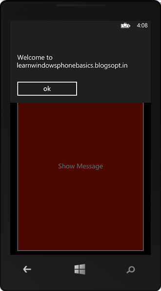
      • Add message box Show(MessageText) method in button event, This code will execute once user tap on Show Message button.
                             void btn_Click(object sender, RoutedEventArgs e)
                             {
                                MessageBox.Show("Welcome to learnwindowsphonebasics.blogsopt.in");
                              }
      • Launch Your First App:
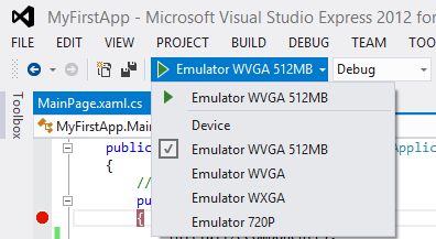
                    Run your application either Emulator or Device using play button on menu bar or press F5 function keyboard button. 
      Launch your App
      Launch Your App
                           
      • Output:
      MyFirstApp Result
      MyFirstApp Result
                                                      
      • Stop your application:
                       You want to stop your running application click RED SQUARE button on Visual Studio menu bar.

      Stop your running app
      Stop your running app


      Great friends we are successfully create first windows phone application.

      Get the source code for MyFirstApp


      Monday, December 22, 2014

      What is Silverlight ?


      • Microsoft Silverlight is a cross-browser, cross-platform implementation of the .NET Framework for building rich interactive application (RIA) for the web and Mobile.
      • Silverlight uses the eXtensible Application Markup Language (XAML) for UI Development.
      • Supports managed code.

      Layout And Grouping Controls:

      What is Layout Control ?
      • Controls that contain other controls are often referred to as layout controls.
      • A layout control serves as the layout root of your app within a page.
      • By default Grid control serves as the layout root With in page.
      • Most of the controls derive from the Panel class.


      Examples for Layout Controls:
      • StackPanel
      Syntax: 
      <StackPanel>
      .................
      </StackPanel>

      • Canvas
      Syntax: 
      <Canvas>
      .................
      </Canvas>

      • Grid
      Syntax: 
      <Grid>
      .................
      </Grid>

      Additional layout controls
      • Panorama
      • Pivot
      The Pivot and Panorama controls derives from ItemsControl.


      What is Pivot Control ?

      • The Pivot control provides a quick way to manage the navigation of views within an application.

      • The control can be used as a navigation interface for switching between views.

      • Each view or section of the control is called the PivotItem.
      • Pivot control is very similar to Tab Control, except navigation, here are two way to navigate to one page to another, you can tap page’s header or swipe (Pan or Flick) control.


      Pivot Control
      PivotControl


      Syntax:
       
      <phone:Pivot Title="pivot"> <phone:PivotItem Header="item1"> .............. </phone:PivotItem> <phone:PivotItem Header="item2"> .................... </phone:PivotItem> </phone:Pivot>


      What is Panorama Control ?
      • Creates a panoramic (wide) view of items that can be panned side to side.
      • The Panorama control is tab navigation control.
      • Its built-in support touch and navigation, no need to implement any functionality for gestures functionality.

      Panorama Control
      Panorama Control
      Syntax:
       
      <phone:Panoram Title="pivot"> <phone:PanoramaItem Header="item1"> .............. </phone:PanoramaItem> <phone:PanoramaItem Header="item2"> .............. </phone:PanoramaItem> </phone:Pivot>


      Text Controls:
      • Text control typically display string content
      • Different types of text controls
        • TextBlock: Use this to display simple read-only of text. Content is set with the Text property.
      Syntax: 
      <TextBlock Text="textblock"/>

        • TextBox: Used for short text input, you can also use it for large, multi-line text input. Content is set with Text property.

      Syntax: 
      <TextBox Text="textbox"/>

        • PasswordBox: Makes the text a user inputs. Content is set with Password property and marked with the PasswordChar property.

      Syntax: 
      <PasswordBox Password="textblock"/>


      Button And Selection Controls:

      • Button and selection controls enable the user to easily choose items or navigate through the app.
      • Most of the button and selection controls are derived from ContentControl, means we added content to them with the Content property.


      Button Controls :
      • Button : Control that responds to user input and raises a click event. Content is set with Content property.
      Syntax: 
      <Button Content="button"/>

      • HyperlinkButton: Represents a button control that displays a hyperlink. When clicked HyperlinkButton enables to move other page, content is set with Content property and URL to navigate to is set with NavigateUrl property.

      Syntax: 
      <HyperlinkButton Content="hyperlinkbutton"/>


      Selection Controls :
      • CheckBox: Represents a control that user can select or clear. A checkbox  optionally an indeterminate state. Content is set with Content property

      Syntax: 
      <CheckBox Content="checkbox"/>

      • RadioButton: Allows a user to select a single option from list of options. When radio buttons are grouped together they are mutually exclusive. Content is set with Content property.

      Syntax: 
      <RadioButton Content="radiobutton"/>

      • Slider: Represents a control that lets the user select from range of values along a track. The Value property sets determines the position on the track.

      Syntax: 
      <Slider .../>


      Windows Phone Controls
      Windows Phone Controls

      Common Controls:
      • ViewBox:
        • The ViewBox controls is content decorate that takes one child element and stretches it or scales it to fit the size of viewbox.
      Syntax:
      <ViewBox Stretch=”UnifromToFill”>
      <TextBlock Text=”this is viewbox control”/>
      <ViewBox>

      • Image Control:
        • Represents a control that displays an image in the JPEG or PNG file formats.

      Syntax:
      <Image .../>

      • RichTextBox:
        • Represents a rich text control that supports formatted text, hyperlink, inline images and other rich content.
      Syntax : 
      <RichTextBox>
      <Paragraph/>
      </RichTextBox>
      • WebBrowser Control:
        • The WebBrowser control provides a surface for displaying HTML content. This control is now based on Internet Explorer 10.
        • Navigation:
          • We can navigate in webbrowser control, by using following events.
          • Navigating: This event is fired when browser starts to navigate Url.This event has NavigatingEventArgs as parameters and by setting Cancel property to true we can prevent user’s navigation to certain Urls.
          • Navigated : This event fired after web site has found and device successfully loads web content.
          • LoadCompleted: This event is fired after all content for the site has been loaded.
      • InkPresenter Control:
        • This control implements a rectangular surface that displays ink strokes.
        • InkPresenter is derived from Canvas and can display one or more UIElement objects and a StrokeCollection.
        • If we want to contain the ink within the InkPresenter control, use the Clip property.

      syntax:  
      InkPrensenter x:Name=”MyIP” />